Pearl Standard Brand Identity
Logo Design • Brand Identity • Graphics Design
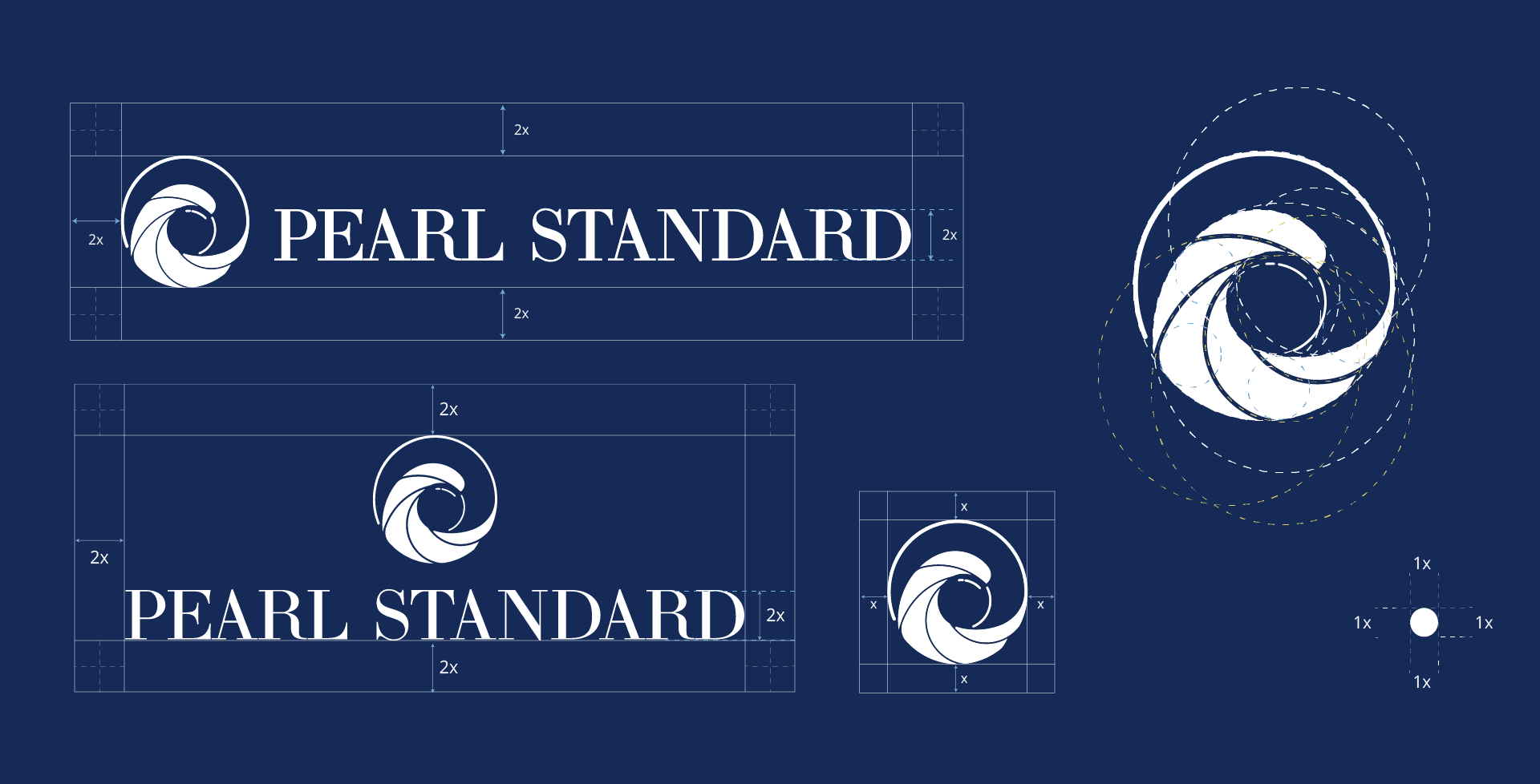
The logo for Pearl Standard draws inspiration from "The Great Wave off Kanagawa," a famous woodblock print by the Japanese ukiyo-e artist Hokusai. This logo is meticulously crafted and proportionately constructed to encapsulate both the elegance and power of the ocean.
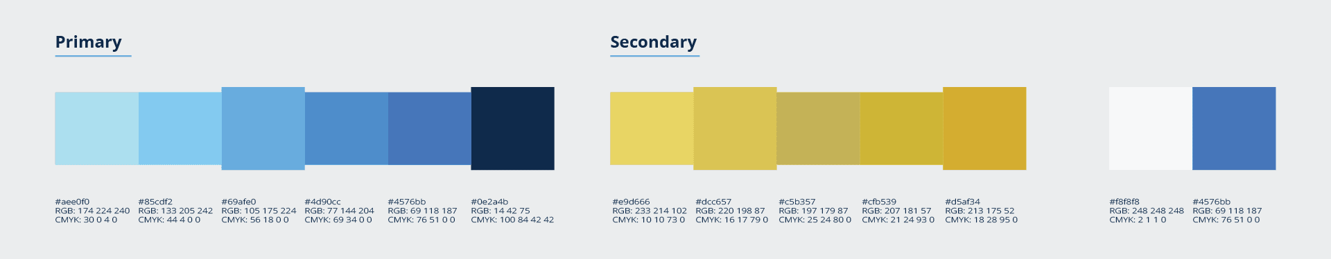
The icon within the logo holds significant meaning. We studied various wave shapes and incorporated a lifting wave to symbolize a pearl, seamlessly integrating it into the design. The use of blue is intentional, representing the ocean, nature, and the environment, which are core to the essence of Pearl Standard.
Through this logo and brand identity project, I aimed to create a visually striking and meaningful symbol that resonates with the company's values and mission.


Type
Company Independent Projects
Year
Duration
Tools
Procreate, Photoshop, Adobe Illustrator